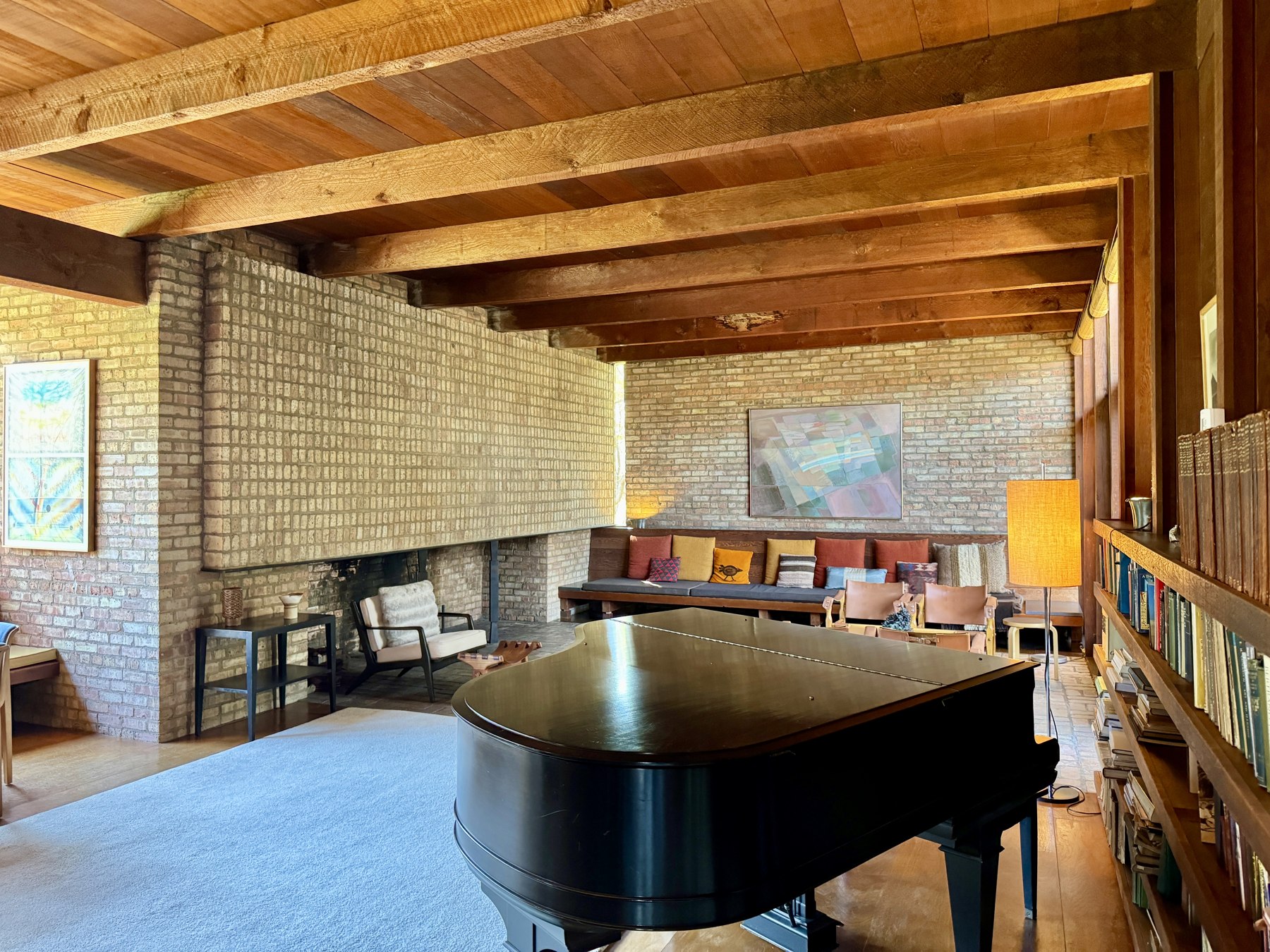
"Expensive" isn't a budget line — it's a set of decisions. The homes that read as elevated usually aren't the ones with the biggest spend; they're the ones where a few specific choices got made on purpose instead of by default.
Lighting does more work than furniture
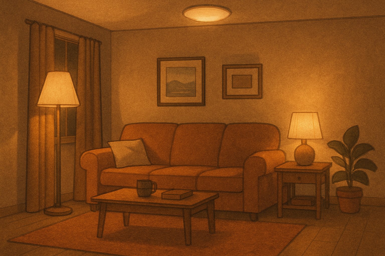
A room lit entirely by one overhead fixture reads as functional, not considered — it's the lighting equivalent of a single default font. Layered lighting (a floor lamp, a table lamp, and something dimmable overhead, used at different heights) is what actually separates a "furnished" room from a "designed" one, and it costs far less than the furniture it's sitting next to.
Warm-temperature bulbs (closer to candlelight than daylight) make almost any room read as calmer and more intentional. Cool white light is the single fastest way to make a nice space feel like a waiting room.
Fewer, better objects beat more objects
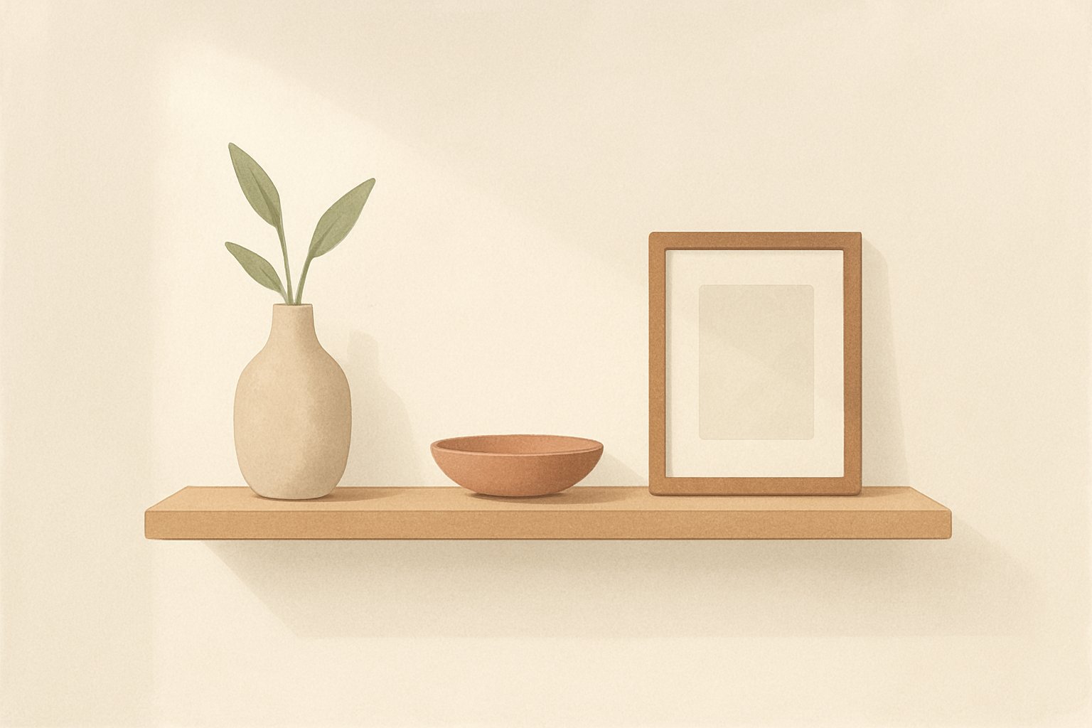
A shelf with twelve small decorative items reads as clutter no matter how nice each item is individually. A shelf with three considered objects and real negative space around them reads as curated. The empty space itself is doing visual work — it's not a gap to be filled, it's the thing that lets your eye land on what's actually there.
This applies to almost every surface in a home: a console table, a kitchen counter, a nightstand. The instinct to fill every flat surface is the instinct to fight against.
Texture variety matters more than color coordination
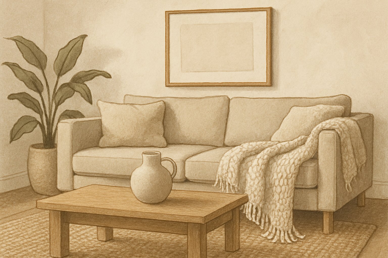
A room where every surface is smooth — glossy paint, smooth fabric, polished wood — reads as flat no matter how well the colors match. A room with real texture variety (a nubby wool throw, a matte ceramic vase, a woven rug, a smooth marble surface) reads as rich even in a fully neutral palette.
This is why a room done entirely in white or beige can still look expensive: the "expensive" part isn't the color, it's that four different materials are doing four different things with light and touch instead of one material repeated everywhere.
Scale is usually the real problem, not style
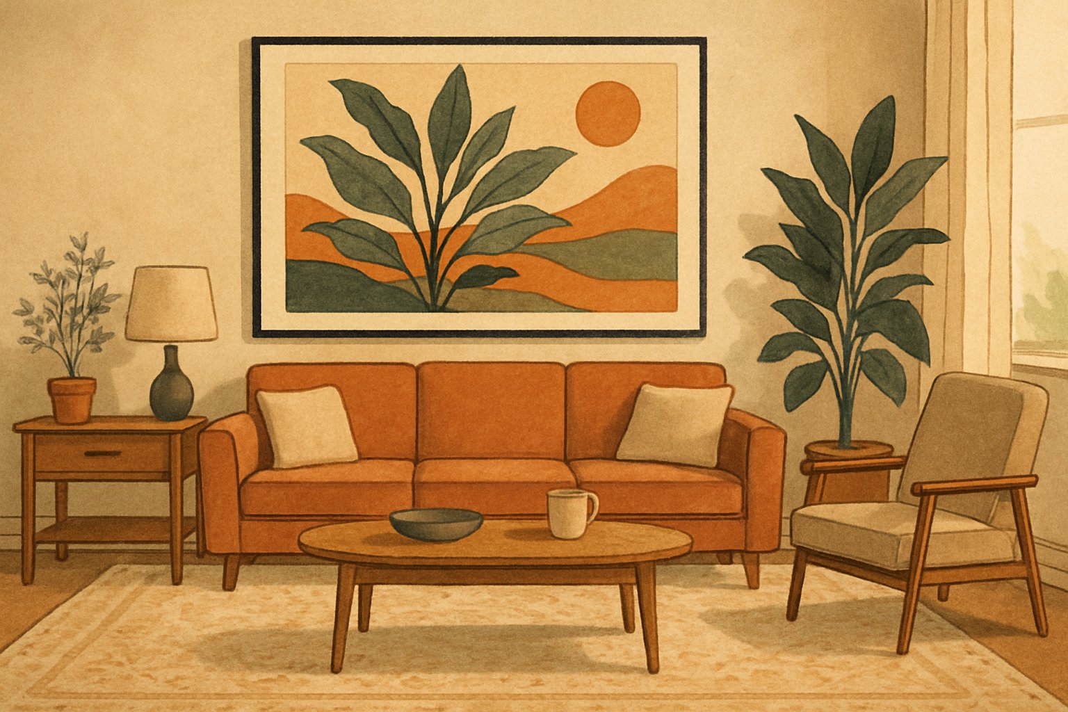
A small piece of art on a large wall reads as an afterthought, regardless of how good the art is. The single most common "why does this room feel off" problem in ordinary homes isn't a style mismatch — it's an object that's simply the wrong size for the space it's in: art too small for its wall, a rug too small for the furniture sitting on it, a lampshade too small for its base.
The general fix costs nothing to understand even if it costs something to execute: a rug should be large enough that at least the front legs of every major piece of furniture sit on it, and wall art should occupy a meaningful fraction of the wall it's on, not float in the middle of empty space.
What this actually looks like, for real
The cover photo above is real too. These two real details from the same house show the texture-variety and considered-object principles in practice, not just in an AI rendering.
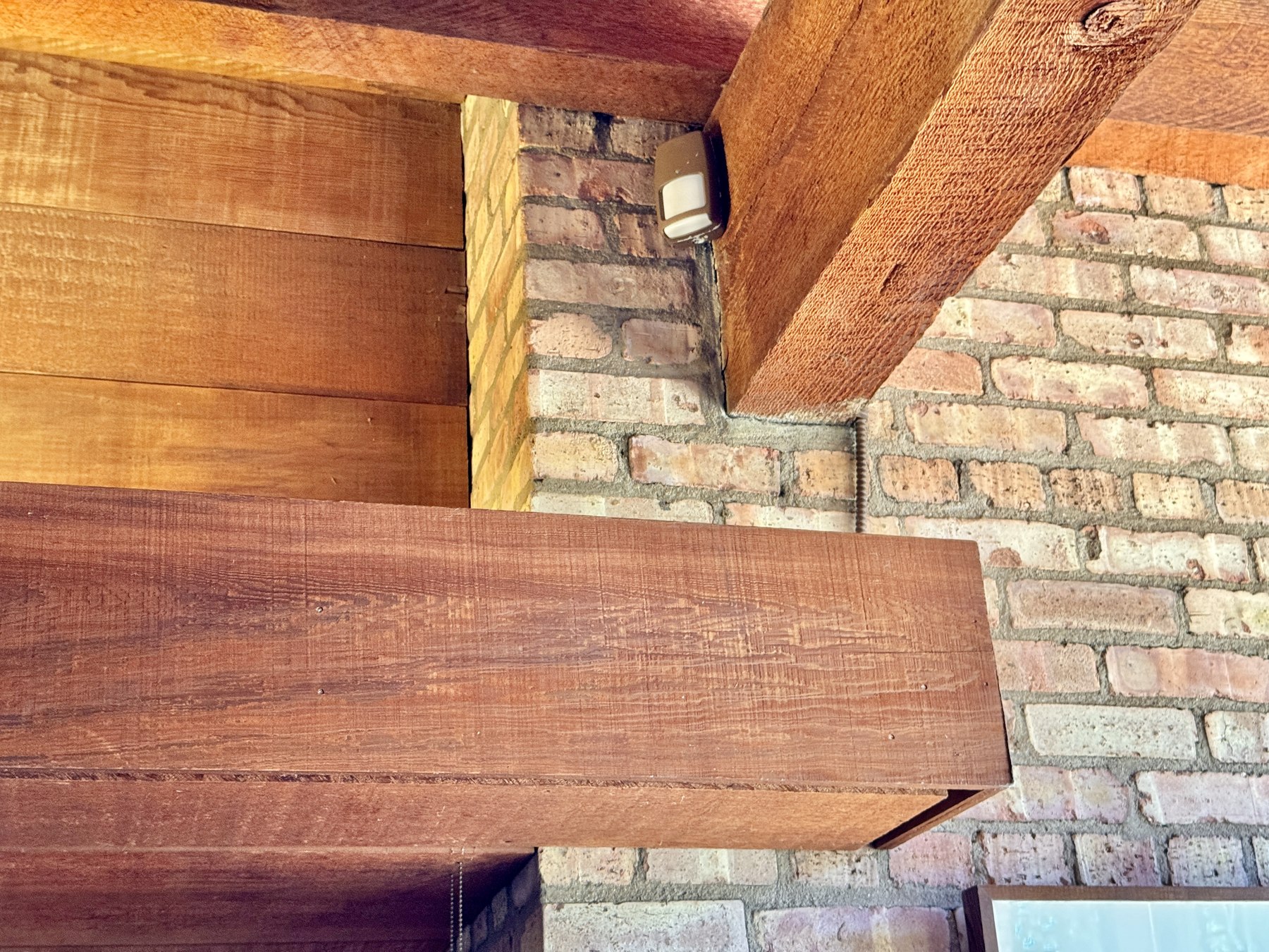
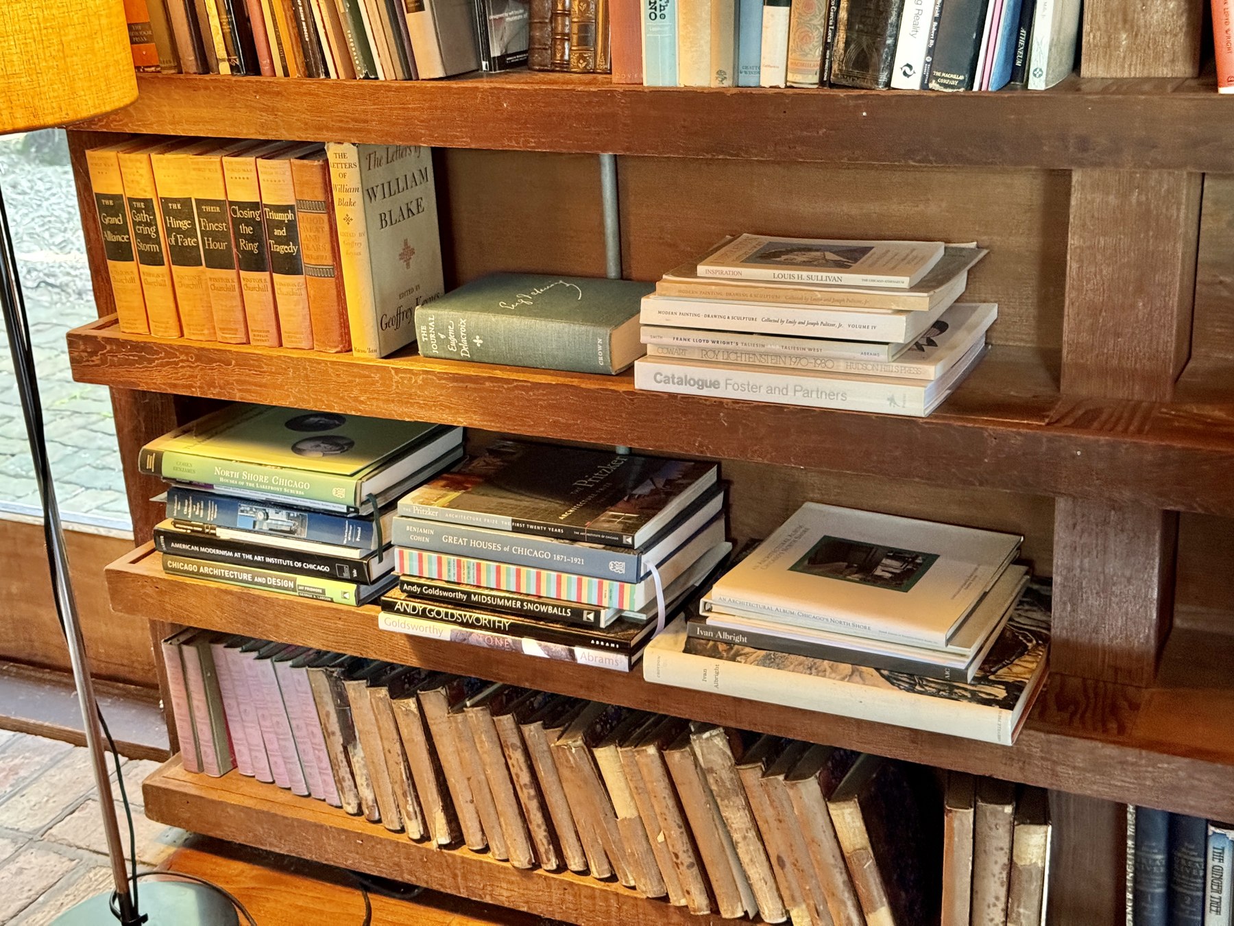
Photo credits: living room, fireplace detail, and bookshelf, Paul Schweiker House and Studio, Schaumburg, IL, by w_lemay, CC BY-SA 2.0, via Wikimedia Commons.
Common questions
Does making a home feel expensive actually require spending a lot of money?
Not necessarily — several of the highest-impact changes here (lighting layering, editing down clutter, correcting scale) are about decisions, not budget.
What's the single biggest mistake people make?
Relying on one overhead light source and filling every flat surface with small objects — both read as "furnished by default" rather than "designed on purpose."
Does this mean minimalism is the only way to achieve this look?
No — a maximalist room can read as expensive too, as long as the same underlying principles (intentional lighting, real texture variety, correct scale) are still present.
Disclosure. This piece reflects general interior-design principles, not a review of any specific product, service, or brand. The cover photo and the photos in the "What this actually looks like, for real" section are real; every other image on this page is AI-generated and clearly labeled as such. DopamineKart did not receive free products or payment related to this piece. Corrections: email us.